
I created this 20-page booklet in Microsoft Word, arranging photos and maps and other illustrations in between and around brief paragraphs to tell the story of these folks from my husband's family tree.
20 pages = bite-sized?
I broke the project down into multiple bite-sized pieces: researching the parents of Rosemary and John and then moving backwards to research their grandparents. One parent was an immigrant, one the child of an immigrant, who met and married in Cleveland, Ohio.
I wrote as I researched and I put their lives in the context of time and place, from birth to marriage to families to working lives to retirement and beyond. I included a page or two about the lives of their siblings, who moved in and out of family homes over the years. The purpose was to show that the main focus ancestors were not "dropped from Mars" but grew up in a household with other siblings, and sometimes relatives from older generations staying in the same home.
Adding in burial details, plus photos and maps and lots of other illustrations, the total page count inched higher, one bite-sized bio at a time. I left a half page empty after the final sentence: Please add your memories here, to encourage recipients to jot notes of their own.
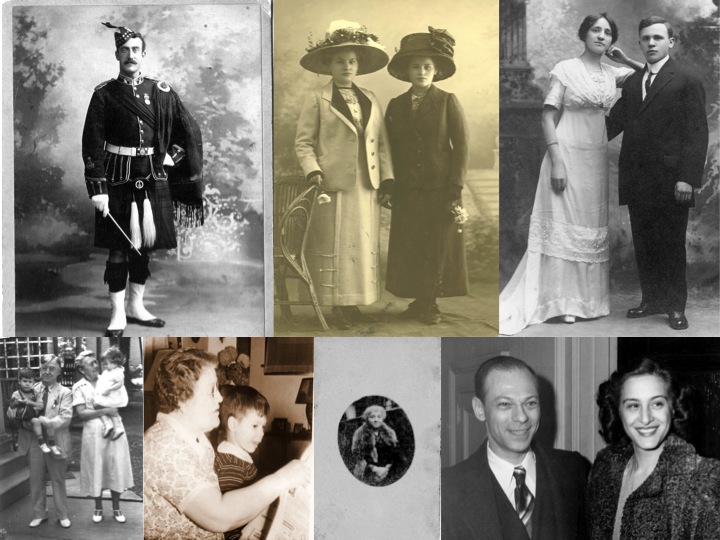
The title page previews the story, as shown above. The reverse side of the title page includes the notation "Researched and written by Marian Burk Wood, 2025," so future generations will know the source of the booklet.
Definitely not boring
Every page has color to draw the eyes of younger relatives, who routinely complain that black and white is boring. Even when I included a black-and-white image (such as a marriage certificate), I tinted it slightly to help it stand out on a white page and I put a narrow color border around it.
Boring lives? Nope. During my research, for instance, I discovered that one couple lived with the bride's parents for more than 5 years during the Depression--even while they coped with a lack of steady jobs and the tragedy of a stillborn first child. My bite-sized narratives showed the drama and also noted the pride when a much-loved child was the very first in the family to attend college.
I kept the paragraphs short and punchy, with enough white space to make the text seem less dense and more readable. Each heading was in color and there were plenty of headings to add to the lively look. Interspersing illustrations everywhere spread out the text and mentioning the dramatic twists and turns helped me to entice readers to turn the page and see what happened next.
Professional presentation
I took the advice of the local print shop and had the booklet digitally color-printed on heavier quality paper. The text and images are sharp and clear as a result, more professional looking than something I could print at home.
The print shop put on a tight spiral binding, with a clear cover to protect the title page and a thick back cover to support the entire booklet. Very professional and much sturdier than stapling the pages together.
Total price: $10 per booklet, printed and ready to pick up in one day. Affordable and professional and readable!
This is one of the ideas I demonstrate in my genealogy presentation, Bring Family History Alive in Bite-Sized Projects. By focusing on a couple or a family (or a special occasion or special place), I can make the family history project practical and doable, not sprawling and overwhelming.
I love doing these kinds of books for family. I did one last Christmas for my siblings about our parents. I'm working on one about our maternal grandparents.
ReplyDeleteGreat booklet to give to family! I love that you included maps! Wish I could see more. ;) Only $10?! Wow, just about five color pages out here would be that much, let alone the rest of it and binding. Great deal. ;)
ReplyDelete